
Designing a microsite for a decentralized exchange platform
DeversiFi Microsite
Scroll ↓

Problem:
One of Squarelink’s core product is the “wallet” or account platform, which allows users to access decentralized applications and manage their crypto assets. Squarelink recently partnered with DeversiFi, an exchange platform that rebranded itself to evolve towards full decentralization.
How can Squarelink utilize the partnership to differentiate itself from other wallets and seamlessly onboard users to the new platform?
Case Summary

Product Team:
UX Designer, Full-stack Developer, Product Manager from Deversifi
My Role:
UX Designer, UX Researcher
Tools:
Sketch, InVision, Whimsical
Project Plan:
1 week of ideation, ~2 weeks of prototype development
October 2019
Final Solution:
View live microsite here: https://get-started.deversifi.com/
Exploration - Understanding Users Needs

Identifying Target Users
Squarelink targets two main groups of users: “Crypto Enthusiasts” and “Crypto Newbies.” I categorized Deversifi users as the latter because many of its users were migrating from the old centralized platform.
Customer Journey Map
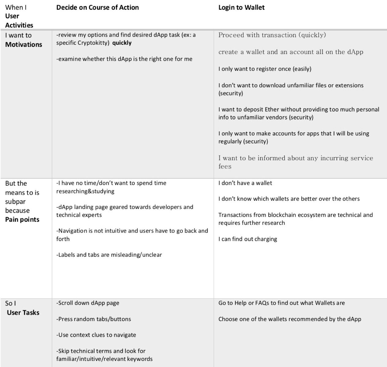
To examine the target user’s full experience during the onboarding stage (connecting to wallet), I used customer journey maps that I had previously documented based on a series of decentralized finance apps.
Then, based on these customer journey maps, I analyzed the user’s behavior at each phase by Motivations (what does the user want to achieve), Pain Points (what difficulties do they encounter), and User Tasks (what do they do as a result).
Exploration - User Flow
I created a User Flow based on the observations from the Customer Journey Map and by dissecting Ethfinex (old version of Deversifi). Because the third phase in the customer journey map (Sign Transaction) was not applicable to the microsite, I decided to focus on the first two phases.
Refinement - MVP & Content Strategy
Information Architecture and content were discussed as a team. I proposed that educating users about the changed/new features of the platform and providing a walkthrough on choosing and connecting to a wallet were primary goals for this microsite.
Main sections following the splash screen consisted of the new product’s core offerings, wallet options, and a separate section positioning Squarelink as an “account solution” next to the other wallet options. Copy and images were provided by the Deversifi design team.
Refinement - Wireframing
Using style components and the splash screen provided by Deversifi, I produced several variations of the design. Final design decisions were made as a team.


You’re almost done reading!
Final Solution
Connecting to your Squarelink Account via Deversifi
Reflection
At Squarelink, partnering with other decentralized application platforms is common. We share a goal – to make onboarding for our users seamless and more intuitive. Whenever we land a new partnership, I am responsible for designing a native interface for each application because each operates differently. Working with Deversifi was a mutually beneficial opportunity because Deversifi was able to gain user insight from a wallet provider’s perspective, and Squarelink was able to expand its presence through a renowned blockchain company.
Because of the limited time, the designs are consistent with Deversifi’s brand but lack variety. For example, the sections on the microsite all laid out horizontally (with animations arranged from left to right). If I could redo my work, I would like to reevaluate the order of contents and information architecture through usability tests.